In order to build anything in this world, you need structure.
As we climb our way higher in markets, let’s take a look at how structure plays a part in understanding how prices have gotten where they are, and where they are most likely to head next.
The manner in which a stock or market has moved up or down can give a trader or investor valuable insight into potential future price movements going forward.
I will give a couple of examples and discuss how understanding the structure of stocks and markets is very useful in your efforts of determining where and when to place a trade or make an investment.
Let’t take a look at the market first to see how the structure can be identified and analyzed. We will use SPY, the ETF for the S&P 500 for our first example.
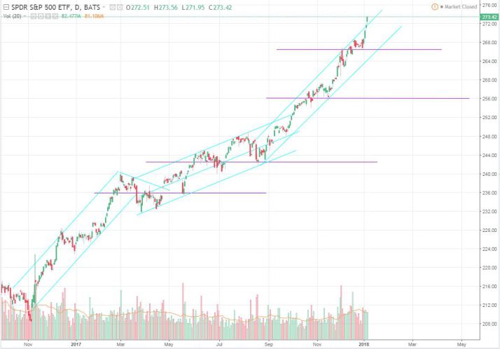
Clearly the market has been trending higher, forklift style, for some time now.
However, along the way it was extremely useful to objectively study the structure of price action as we cruised higher in markets.
When looking at the chart without any structural analysis, one may think the current price of markets is too high to be involved in any fashion. This would be an incorrect analysis in our opinion as long as the structure remains healthy below, because there is not enough information telling us to exit the market. This does not mean the market will not move lower to potential support levels below, it means that when and if it does, we look to analyze the move lower and the reaction to prices there at the lower areas of the charts “structure”.
Just as you would build a house or other structure on a solid foundation, we look for charts that are moving higher on solid foundations as well.
By using simple trendlines and support/resistance levels, as well as volume profile analysis, a trader or investor can attempt to judge where there is a healthy structure vs an unhealthy structure.
When a stock or index climbs higher by forming a base, consolidating in that base, and then breaking up and out of that base into price discovery, that is a healthy move higher with a measurable foundation below it. If a move lower begins to take shape, the ambitious trader may begin to look for levels below which were old levels of resistance, and may now become “potential support” on a move lower.
Lets look at a chart that is pretty popular right now and attempt to diagnose whether or not the structure of this chart is worthy of watching for a potential long trade.
The chart is SRAX, take a look.

How would you look at this chart? Is it Bullish? Bearish? Neutral?
In our view this is healthy structure and worth watching for a potential move higher out this second consolidation, in what looks to be a potential trend higher.
Notice how price made an initial move higher from the 1.50 area all the way to near 6.00 in a “stair step” style trend. Then prices began a consolidation lower in a larger flag type pattern until another move took place taking prices up and out of the newly formed consolidation or “base” to new higher prices once again.
Now the stock has “flagged” again into a potential support area of the developing trend, just as it did previously before making a substantial move higher. This is why we have the stock on our grid going into next week.
This stock is also one of the many which is seeing “catalyst” moves higher related to bitcoin speculation, and that should be taken into account as well when determining whether there is a good risk/reward in this trade setup.
We hope you have enjoyed this presentation on the way we analyze structure in stocks and markets and will be back with much more to say on this subject very soon!
Stay tuned and have a great weekend! Cheers.
-JP
Share