After having worked through descriptions, flowcharts, storyboarding and UI charts a design can be transferred from paper to screen.
Below is a mock up of my ‘Making Toast Interactive’, created using Adobe Illustrator.
First I created the grid and basic wire framing within the outlines of the media the interactive is designed for, in this case the iPad.
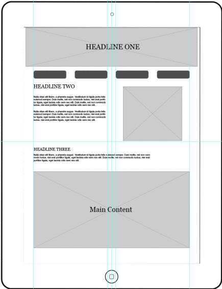
Basic wireframing for making toast interactive
Once the wire framing was in place I added in the main content.
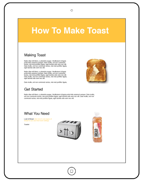
Making toast interface with main content
After the content had been added I created the interactive elements such as the buttons and the progress bar.
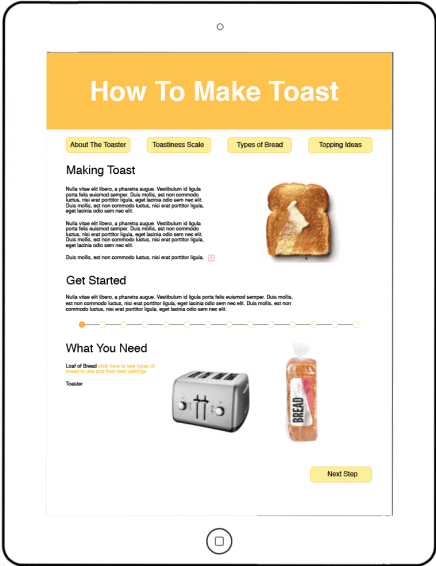
Making toast interactive with buttons and progress bar
The next layer in my illustrator file included the highlights, the highlights in this interaction occur when the user touches certain elements. This is illustrated bellow with a bold yellow.
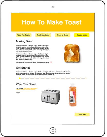
Making toast interactive with brighter yellow highlights
The last layer in my illustrated mock-up was a gestures layer, showing the gestures used to navigate through the content.
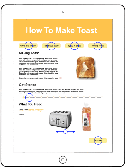
Making toast interactive with gestures
Advertisements Share this:

