This meme was started by Books by Proxy, whose fabulous idea was to compare UK and US book covers and decide which is we prefer. This week the theme is green covers, so I’ve chosen Tom’s Midnight Garden by Philippa Pearce. Though I apologise for the general lack of greenness…
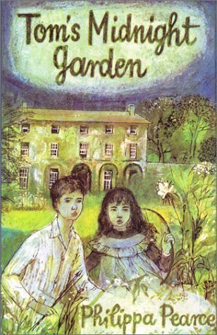 This is the offering produced by Greenwillow Books in October 1992. This is the cover that prompted me to choose this one – I love it as I think it very much embodies the sense of magic and time dislocation within the book. I love the fact that Hannah is also featured on the cover.
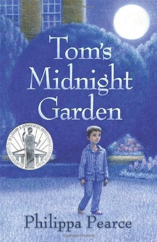 This cover produced by Oxford University Press in January 2008 also captures the magical quality of the story. The impressionistic depiction of Tom and the moonlit-swathed garden is lovely.
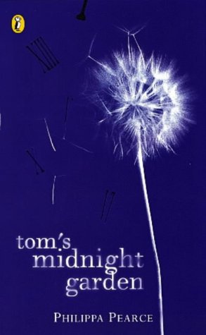 This cover produced in April 2005 by Puffin is probably my least favourite, though it’s too pretty for me to actually dislike. My problem is that although the dandelion is stunning against the dark blue background, the design doesn’t provide the reader with any kind of clue about the story.
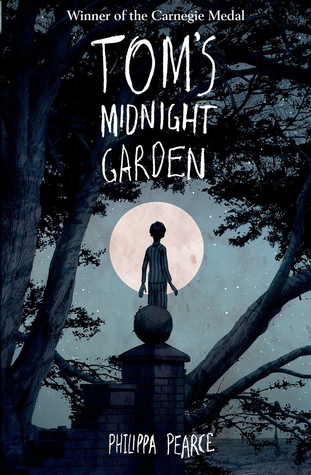 This effort was produced by Oxford University Press in April 2015 and is lovely. The image of Tom outlined against the moon and framed by the trees is magical and again, very much captures the mood of this classic novel.
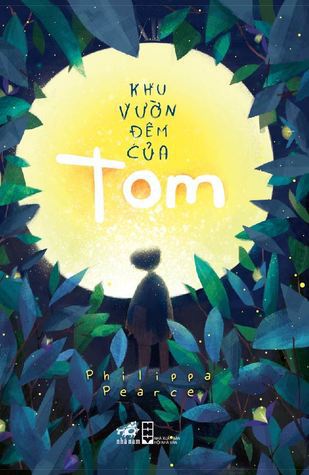
This Vietnamese edition, produced in September 2015 by NXB Hội Nhà Văn, Nhã Nam is also very beautiful. The leaves with the moonlight glinting off them and the small, foreshortened little boy almost swallowed up by the huge yellow moon gives a real sense of Tom’s constant need to revisit the garden as he is caught up in the time loop. And my favourite? I cannot decide! Apart from the Puffin cover, I think they all beautifully evoke the mood and content of the book – and they are all lovely…
What do you think?
Advertisements Share this:

