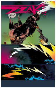
Two comic artists: Osamu Tezuka – the well-known Japanese creator of Atom, Black Jack and Phoenix among others, and Morris – the Belgian artist of Lucky Luke
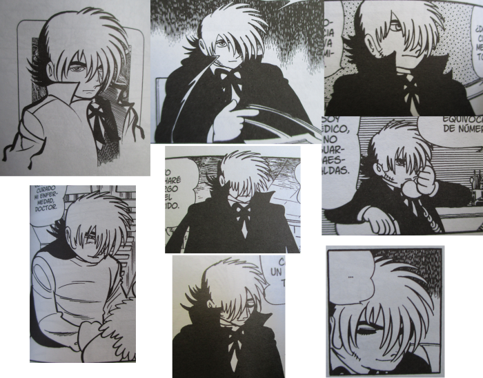
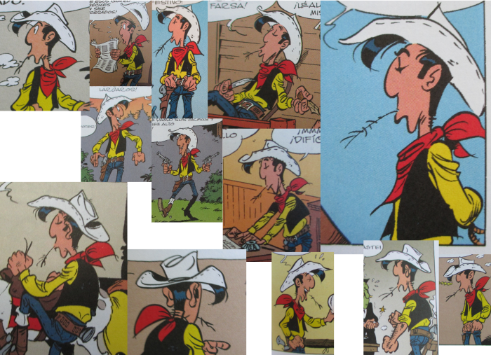
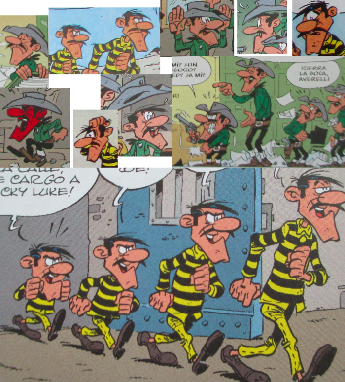
I took pictures to one volume of Black Jack and three volumes of Lucky Luke to juxtapose different panels to compare the way the characters are drawn.
Regardless of the style differences, there is something pretty different in their respective use of the lines.
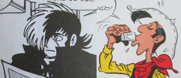
There is a component of “roughness” in Tezuka’s lines, wherever Morris’ are more sophisticated ones, varying in side/thickness depending on what’s depicting, and remains consistent of that thickness in every panel. There is consistence in shape.
In comparison, there is less consistency on how characters look in Tezuka’s art. Shapes vary panel to panel, while the characters remain recognizable.
Both approaches work, it isn’t that one is better than the other or more “professional”. Both have different kinds of impact and achieve their own goals. Considering the tones of each comic, Lucky Luke being a rather straightforward western comedy, and Black Jack being a medical drama with both somber and goofy moments, the artstyles reflect that.
Furthermore, you could argue that Tezuka’s artstyle drags a lot from animation tradition on both the lines and character consistency: Just as in animation, while characters have a model to follow on how they look, each drawing has small differences on . Morris, on the other hand, lacks that attribute.
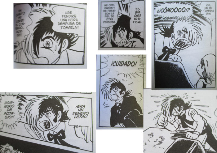
Last but not least, this gives Tezuka more freedom of variation in expressions, as his art style possesses more elasticity thanks to having less strict standards, making it more malleable to different situations, giving it a more cartoony quality.
Advertisements Share this: