From 2002 to 2013, binge drinking decreased by 2% in men while it increased by 13% in women.
Huge differences in alcohol consumption by most people versus the upper 10%.
I wanted to blog about a recent article in The New York Times about binge drinking, but with a different focus than that of the author. Gabrielle Glaser is the author of the recent book Her best-kept Secret: why women drink – how they can regain control. She’s more interested in getting into issues of treatment, which is the focus of the book. I want to focus on a provocative chart the article, that probably underscores her some of her points in the article more than she emphasized.
A reminder to check tables and graphs in articles. Don’t just gloss over the valuable information they may display.
But before I could write my blog, I discovered that my Facebook friend Mike Miller was already discussing it on his personal page. So I just borrowed from that with attribution. Then I found that he had previously touched on this topic and so I reproduced it as well. I recommend becoming Mike Miller’s friend on Facebook. I found it worth it to have his posts displayed at the top when I go to my news feed.
The article
The New York Times article is
The graph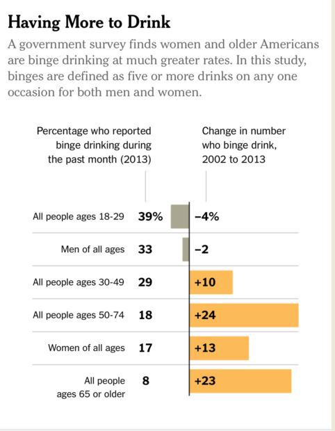
Mike’s current Facebook page directs us to an earlier comment that he made about a graph in another articleThe headline doesn’t say it, but the drawing suggests it — the “people consuming more alcohol” are women. From 2002 to 2013, binge drinking decreased by 2% in men while it increased by 13% in women. I’ve been noticing a few alcohol marketing and advertising schemes targeting women recently. You might also have noticed that the booze industry has broken it’s decades-old promise not to advertise hard liquor on television. They started doing it a few years ago and they’ve been ramping up since then. They’ve been using product placement and movies like “Bad Moms” and sneaky ads like the one shown in my first comment. The usual message is that parenting is very stressful and alcohol is great for stress and good clean fun, so let lose and have a drink. I also see this way of thinking promoted on Facebook.
Mike Miller September 26, 2014 ·
The article in the Washington PostThink you drink a lot? This chart will tell you
The graph
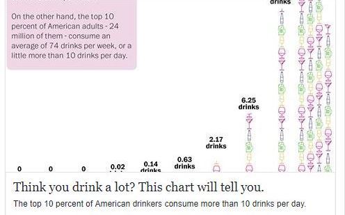
Advertisements Share this:This is nuts! Friends of mine in Epidemiology who studied alcohol consumption told me about this years ago — that most consumption is by alcoholics and the alcohol industry is very aware of it. So the chart shows that half of American adults are drinking an average of about 1.7 drinks per *year* while the upper 10% is drinking 7 times that much per *day*. It looks like about 75% of consumption is by alcoholics.