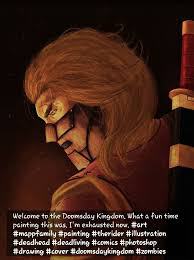
Doomsday Kingdom, created by YouTuber, Ronny Haze and artist, James Milne, is a new indie zombie comic series. In this exciting, suspensful first issue, we are instantly emerged into the world.
There will be no spoilers for this review, since it’s the very first issue and some of you may be looking to start reading. I would like to start by apologizing for the late review. Issue 2 is currently available, and I will be reviewing that soon enough.
Writing
I was gripped from the very first panel. Ronny did a great job of setting this issue up. I especially enjoyed how it came full circle in the end. It perfectly mirrored the first panel. The way the story was told was interesting to me. The entire issue (other than the first page and the last) was told in flashbacks, which intrigues me since the entire issue itself was a flashforward.
Another thing I enjoyed was the set up. Ronny Haze did a great job at building the world in a clear image (with the help of James, of course). The introduction to the zombies, or Creeps, as they’re called, was brilliant. I love how they slink from the shadows to feed on their prey (no spoilers).
Throughout the issue, there are tons of twists and turns. I loved the idea of a zombie shield, which completely caught me off guard, seeing as I wasn’t expecting it.
Of course, there were a few minor complaints. Near the end of this 22 page comic, there’s a huge block of text. This sort of took me out of the moment. I’m a huge reader. Don’t get me wrong, I read a lot in my free time, but I think the huge block of text could have been broken down into smaller blocks.
I also wish we had gotten more from this issue. Not a whole lot happened. We’re introduced to the Rider, who had a prisoner before he was taken in by a group of people. That’s basically it. There was some good foreshadowing, and a lot of questions weren’t answered, which has me excited for the issues to come.
Art
The art blew me away. It was incredible. Unlike The Walking Dead, Doomsday Kingdom is illustrated with color. That’s what I feel The Walking Dead lacks. I get what they’re doing. The black and white makes it darker. But I sometimes wish certain things were in color, just to show the gore.
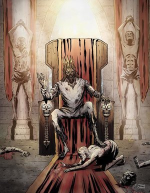
Overall, Doomsday Kingdom #1 was a great first issue. From the very beginning, it had my attention and held onto it throughout the whole thing. Not a lot of comics can do that.
Subscribe to Make A Path Presents (Ronny’s channel) on YouTube. Since I don’t really have an email list set up, go ahead and send me an email at welch408isaac@gmail.com so you don’t miss any posts.
Coming up, we have a review for The Walking Dead #175, and then a review for Doomsday Kingdom #2.
Share this: